How to Choose the Perfect Neutral Paint Colors for 2026 Based on Your Room’s Natural Light
Ads
Choosing the right neutral paint colors in 2026 requires analyzing your room’s natural light direction, as the same shade can appear dramatically different depending on sunlight exposure throughout the day.
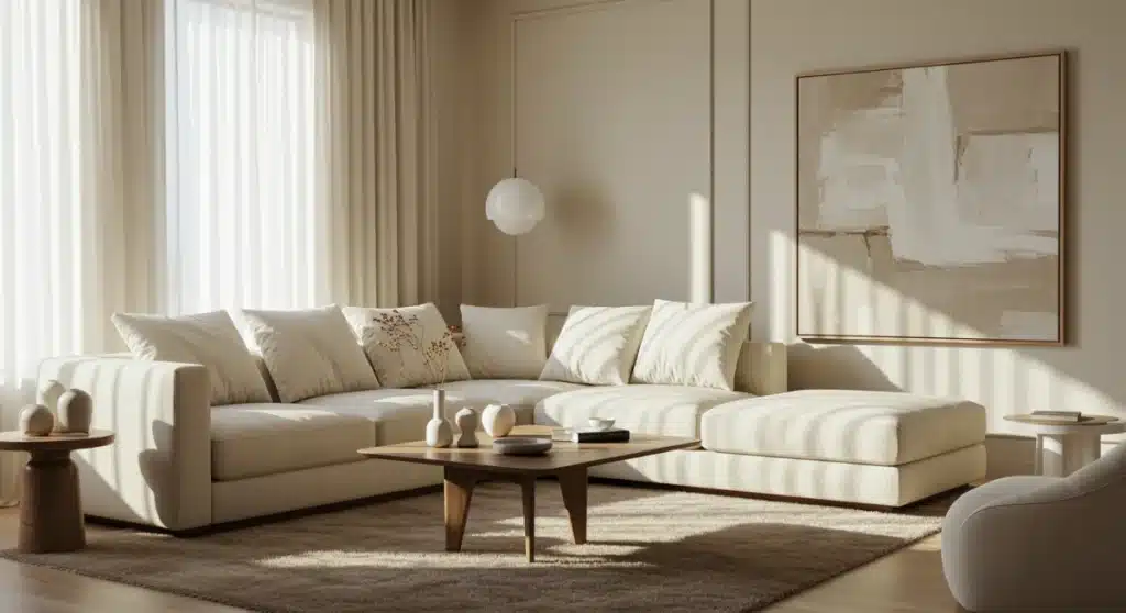
When you walk into a paint store, those little swatches can look completely different once you get them home. The reason lies in something many homeowners overlook: the natural light streaming through your windows shapes how every color reads on your walls. Understanding this relationship between light and color will save you from expensive mistakes and help you create spaces that feel exactly right. How to choose the perfect neutral paint colors for 2026 based on your room’s natural light starts with recognizing that the same beige that looks warm and inviting in one room might appear dull or even gray in another. This guide breaks down everything you need to know to make confident color decisions this year.
Understanding How Natural Light Affects Paint Colors
Natural light is not constant. It shifts throughout the day, changing in intensity, temperature, and direction. This dynamic quality means that a paint color you fall in love with at noon might look entirely different in the evening or on a cloudy morning. The key lies in understanding how different light conditions interact with your wall colors.
Warm light, which comes from southern and western exposures, tends to enhance yellow, orange, and red undertones in paint. This means warm neutrals like beige, cream, and soft taupe often look richer and more inviting in these spaces. Cool light, characteristic of north-facing rooms, amplifies blue and gray undertones, making cool neutrals appear crisper and more defined. East-facing rooms receive warm morning light that shifts to cooler tones by afternoon, creating a unique challenge for color selection.
Beyond direction, the quality of light varies based on your geographic location, surrounding buildings, trees, and even the season. A room that feels bright and warm in summer might seem dim and cool in winter. This is why professional designers always recommend testing paint samples on your walls before committing to any color.
Why Testing Paint Samples Matters
- Natural light reveals undertones that artificial store lighting cannot show
- Colors appear different at various times of day and in different weather conditions
- Testing prevents costly mistakes and the disappointment of repainting
- Samples allow you to see how the color interacts with your existing furniture and decor
When testing, apply samples to large areas of your wall and observe them over several days. Pay attention to how the color changes from morning to evening and on both sunny and overcast days. This patience pays off with a color you’ll love for years to come.
Identifying Your Room’s Light Direction
Before selecting any neutral shade, you need to determine which direction your windows face. This basic orientation dictates the dominant quality of light your room receives and serves as your foundation for color selection. Understanding your light direction eliminates guesswork and points you toward the neutral families that will work best in your space.
North-facing rooms receive the coolest, most consistent light throughout the day. This light tends to have blue undertones, which can make warm neutrals appear muddy or dull. If your room faces north, cool-based neutrals with subtle blue or violet undertones will counteract this tendency and create a balanced, welcoming atmosphere. South-facing rooms enjoy the most abundant natural light, typically warm and golden. This abundant warm light allows you to experiment with both warm and cool neutrals, though warm shades often feel most harmonious in these bright spaces.
East-facing rooms experience warm, rosy light in the morning that gradually cools as the day progresses. This shifting quality suggests versatile neutrals that perform well in varying conditions. West-facing rooms receive cool morning light that transforms into warm, intense afternoon and evening sunlight, presenting unique challenges that require careful consideration.
Assessing Your Specific Light Conditions
- Note which walls receive direct sunlight and at what times
- Consider window size and placement—larger windows bring in more light
- Account for external factors like tall buildings, trees, or landscaping that block or filter light
- Evaluate how light changes throughout the seasons
Take time to observe your room at different times before making any color decisions. This investment of attention prevents disappointment and ensures your chosen neutral enhances rather than fights against your room’s natural qualities.
The Best Neutral Paint Shades for 2026
This year’s neutral paint trends reflect a growing desire for warmth, comfort, and timeless elegance. Homeowners are moving away from the stark grays of recent years toward more nuanced neutrals that bring soul and character to spaces. The palette emphasizes versatility, sustainability, and the ability to create cohesive flow throughout homes.
Warm neutrals dominate 2026 trends, with shades like honey beige, soft almond, and warm limestone gaining popularity. These colors bring instant coziness and work particularly well in open-concept living spaces where you want flow and continuity. Cool neutrals remain relevant but have softened considerably, with options like misty gray, pale silver, and tranquil dove offering sophisticated alternatives to the stark grays of the past decade.
The rise of biophilic design has influenced neutral selections, with earthy tones like sand, taupe, and clay becoming go-to choices for those seeking connection to nature. These shades work beautifully in any room and provide excellent backdrops for bringing in natural materials like wood, stone, and plants. Additionally, subtle warm whites have replaced pure whites in many homes, as these softer options feel more inviting and age better over time.
Top Neutral Picks by Light Category
- Warm light rooms: Alabaster, Creamy, Swiss Coffee, Pale Oak
- Cool light rooms: Repose Gray, Agreeable Gray, Passive, Worldly Gray
- All-purpose neutrals: Edgecomb Gray, Natural Wicker, Agreeable Gray
- On-trend warm whites: White Dove, Simply White, Pale Powder
Remember that paint formulations vary between brands, so a color named “Cream” in one manufacturer might differ significantly from another. Always verify the specific formulation and test it in your space before purchasing.
Matching Neutrals to North-Facing Rooms
North-facing rooms present the most challenging conditions for neutral paint selection. These spaces receive cool, blue-tinted light that remains relatively consistent throughout the day but lacks warmth. Without strategic color choices, north-facing rooms can feel cold, unwelcoming, and smaller than they actually are.
The solution lies in selecting neutrals with warm undertones that counteract the natural coolness of north light. Avoid cool grays and beiges, as these will appear flat and lifeless in this lighting. Instead, gravitate toward warm-based neutrals like creamy beige, soft peach, or warm taupe. These colors absorb the cool light and reflect warmth back into the room, creating a comfortable ambiance.
Consider paint colors with subtle pink, peach, or yellow undertones. These warm notes become more pronounced in north light and help the room feel inviting rather than clinical. Warm whites work exceptionally well in north-facing spaces, providing clean brightness without the starkness of pure white. Colors like Benjamin Moore’s White Dove or Sherwin-Williams’ Alabaster perform beautifully in these conditions.
If you prefer cooler neutrals, look for options with subtle violet or blue undertones that complement rather than compete with the room’s natural light. The goal is balance—your paint should work with the light to create a harmonious space rather than fighting against the room’s natural tendencies.
Optimizing South-Facing Rooms with Warm Neutrals
South-facing rooms are the envy of many homeowners because they receive the most abundant natural light throughout the day. This generous light supply opens up broader color possibilities, allowing you to embrace both warm and cool neutrals with confidence. However, the warm quality of this light requires careful consideration to avoid colors that appear too orange or yellow.
The golden light that floods south-facing rooms enhances warm neutrals, making them appear richer and more vibrant. This makes cream, beige, and warm taupe excellent choices that will look stunning in these bright spaces. You can also venture into cooler territory, as the abundant light prevents cool neutrals from appearing too cold or stark. Light grays, soft silvers, and subtle blues can work beautifully in south-facing rooms, adding visual interest without overwhelming the space.
Be cautious with very warm neutrals that lean heavily toward yellow or orange. While these colors might look perfect in the morning, the intense afternoon light can make them appear overwhelmingly warm or even garish. Testing samples at different times of day becomes especially important in south-facing rooms to ensure your chosen color maintains its desired character throughout the day.
Maximizing Light in Darker South Rooms
- Use lighter neutral shades to bounce available light around the room
- Reflect light strategically with mirrors and glossy finishes
- Avoid dark neutrals that absorb light and make spaces feel smaller
- Consider the room’s function—brighter neutrals work best in living areas
South-facing rooms also offer the opportunity to use more saturated neutral colors. If you’ve avoided deeper taupes or richer beiges because of lighting concerns, these spaces might be the perfect place to experiment with bolder neutral statements.
Balancing East and West Exposure with Strategic Shades
East and west-facing rooms present unique challenges because the light quality changes dramatically throughout the day. Understanding these patterns helps you select neutrals that perform well under varying conditions and maintain their intended character regardless of the time.
East-facing rooms receive warm, rosy light in the morning that gradually cools as the day progresses. This pattern suggests neutrals that work well in both warm and cool conditions. Avoid colors with strong undertones in either direction, as these will appear exaggerated at different times. Instead, look for balanced neutrals with subtle warmth that reads well throughout the day. Warm whites and soft creams typically perform best in east-facing spaces.
West-facing rooms experience the opposite pattern—cool morning light that transforms into warm, intense afternoon and evening sunlight. This dramatic shift can cause colors to look entirely different from morning to night. The afternoon light especially can make warm neutrals appear very saturated, while cool neutrals might look surprisingly good during these golden hours. Consider testing your top choices carefully in west-facing rooms, paying particular attention to how they look in late afternoon and evening.
For both exposures, mid-tone neutrals often work better than very light or very dark options. These balanced shades provide enough flexibility to adapt to changing light conditions without appearing too extreme in any direction.
Practical Tips for Testing and Selecting Your Perfect Shade
Armed with knowledge about your room’s light direction and the 2026 neutral trends, you can now focus on the practical process of selection. This phase requires patience, systematic testing, and attention to how colors interact with your existing elements. The right approach ensures satisfaction with your final choice.
Start by narrowing your choices to three or four candidates that align with your room’s light conditions and your personal style. Purchase sample sizes of each and apply them to large sections of your walls—don’t rely on small swatches, as they cannot accurately represent how color reads in a full room. Observe these test areas over several days, noting how they appear in morning, afternoon, and evening light.
Consider your room’s other elements when evaluating colors. The undertones in your flooring, trim, furniture, and decor should harmonize with your wall color rather than create visual conflict. Bring fabric samples, flooring swatches, or even photos of your existing elements when shopping for paint to ensure coordination.
Final Selection Checklist
- Does the color look good at different times of day?
- Does it harmonize with your existing furniture and decor?
- Does it achieve the mood you want for the space?
- Will it remain appealing as seasons and light conditions change?
- Does it fit within current design trends while offering timeless appeal?
Trust your instincts but verify with testing. The perfect neutral paint color should make your room feel exactly right—welcoming, balanced, and reflective of your personal style. Take the time to find it, and you’ll enjoy the results for years to come.
| Room Direction | Recommended Neutral Type |
|---|---|
| North-Facing | Warm neutrals with peach, pink, or yellow undertones to counteract cool light |
| South-Facing | Both warm and cool neutrals work well due to abundant natural light |
| East-Facing | Balanced warm whites and soft creams that adapt to changing light |
| West-Facing | Mid-tone neutrals that handle dramatic light changes throughout the day |
Frequently Asked Questions
For north-facing bedrooms, choose warm neutrals with subtle peach, yellow, or pink undertones. Colors like Benjamin Moore’s White Dove, Sherwin-Williams’ Alabaster, or warm beiges work best because they counteract the cool blue light and create a cozy, inviting atmosphere. Test samples on your walls and observe them throughout the day before committing.
Rooms with changing light conditions, like east or west-facing spaces, require mid-tone neutrals with balanced undertones. Avoid colors with strong warm or cool tendencies, as these will appear exaggerated at different times. Warm whites and soft creams typically perform well. Always test samples over several days to see how your color changes throughout the day.
Yes, warm neutrals dominate 2026 paint trends. Shades like honey beige, soft almond, warm limestone, and subtle warm whites are extremely popular. This shift reflects a desire for comfort and coziness in home spaces. However, cool neutrals remain relevant but in softer, more nuanced forms like misty gray and tranquil dove.
Test paint samples for at least three to five days, observing them at different times throughout each day—morning, afternoon, evening, and at night. This timeframe allows you to see how colors perform in various lighting conditions, including cloudy days. Apply samples to large wall areas rather than small swatches for accurate assessment.
Using the same neutral throughout creates cohesive flow, but adjustments may be necessary for different light exposures. A warm neutral that looks perfect in a south-facing living room might appear too dark in a north-facing hallway. Consider using the same color family with slight variations to maintain cohesion while accommodating different lighting conditions in each room.
Conclusion
Choosing the perfect neutral paint colors for 2026 based on your room’s natural light doesn’t have to feel overwhelming. By understanding how light direction affects color perception, identifying your room’s exposure, and testing samples systematically, you can confidently select neutrals that transform your space into something truly special. Remember that the best choices work with your room’s natural qualities rather than against them, creating environments that feel balanced, welcoming, and uniquely yours. Take your time with the process, trust your observations, and enjoy the journey of finding colors that you’ll love for years to come.


